Writing a TrueType font renderer
Reading time: 15 minutes
Table of contents
✱ Note
Text is the medium of digital interaction, and text rendering has an outsized impact on the overall fit and finish of any system. It therefore pains me that axle has for years relied on a low-resolution 8x8 bitmap font. Let’s fix it!
Take a look at the characters composing this sentence. Note the curves, the negative space, the use of size and distance.
If you’ve got a magnifying glass handy, you can even see how ‘black-on-white’ text uses many shades of gray to make the text smoother on the eyes. I’ll show you:
Font rendering comes down to telling the computer which pixels should be on or off, which should be darkened slightly for effect and which should let the background shine through.
The challenge comes from describing this to the computer in a way that’s efficient and resizable. Fonts shouldn’t take up too much storage, and we should be able to scale a font to any size the user requests while preserving the character✱ of the font design. Perhaps most importantly, we’ll want to satisfy these constraints while also making the text pleasant to read.
✱ Note
Minimalist Text Renderer
Let’s do away with all of these requirements for now, and start off with the simplest viable approach to rendering characters. How might we go about coloring pixels into text?
Firstly, we’ll select a fixed size for each character. We’ll agree that every character will be exactly 8 pixels wide and 8 pixels high. That gives us a grid of 64 pixels per character to work with.
We can use a simple data format that describes whether each pixel in our 8x8 grid should be on (colored with the font color) or off (retain the background color). We can draw out our character grid like so:
_ _ _ _ _ _ _ _
_ _ _ _ _ _ _ _
_ _ _ _ _ _ _ _
_ _ _ _ _ _ _ _
_ _ _ _ _ _ _ _
_ _ _ _ _ _ _ _
_ _ _ _ _ _ _ _
_ _ _ _ _ _ _ _
Since we’ve got 8 pixels in each row, and each pixel has two states, it’s natural to store each row in our grid as one byte. For example, we could represent a capital A using a representation like the following:
Byte 1: 0 0 1 1 0 0 0 0
Byte 2: 0 1 1 1 1 0 0 0
Byte 3: 1 1 0 0 1 1 0 0
Byte 4: 1 1 0 0 1 1 0 0
Byte 5: 1 1 1 1 1 1 0 0
Byte 6: 1 1 0 0 1 1 0 0
Byte 7: 1 1 0 0 1 1 0 0
Byte 8: 0 0 0 0 0 0 0 0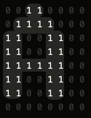
This is equivalent to the following hexadecimal representation:
Byte 1: 0x0c
Byte 2: 0x1e
Byte 3: 0x33
Byte 4: 0x33
Byte 5: 0x3f
Byte 6: 0x33
Byte 7: 0x33
Byte 8: 0x00
… and allows us to very efficiently store render maps for ASCII:
uint8_t ascii_map[256][8] = [
    // 64 previous entries...
    {0x0C, 0x1E, 0x33, 0x33, 0x3F, 0x33, 0x33, 0x00}, // U+0041 (A)
    {0x3F, 0x66, 0x66, 0x3E, 0x66, 0x66, 0x3F, 0x00}, // U+0042 (B)
    {0x3C, 0x66, 0x03, 0x03, 0x03, 0x66, 0x3C, 0x00}, // U+0043 (C)
    {0x1F, 0x36, 0x66, 0x66, 0x66, 0x36, 0x1F, 0x00}, // U+0044 (D)
    {0x7F, 0x46, 0x16, 0x1E, 0x16, 0x46, 0x7F, 0x00}, // U+0045 (E)
    {0x7F, 0x46, 0x16, 0x1E, 0x16, 0x06, 0x0F, 0x00}, // U+0046 (F)
    {0x3C, 0x66, 0x03, 0x03, 0x73, 0x66, 0x7C, 0x00}, // U+0047 (G)
    {0x33, 0x33, 0x33, 0x3F, 0x33, 0x33, 0x33, 0x00}, // U+0048 (H)
    // ...
];
This is quite a tidy encoding! To render a character, we can directly look up its render map using its ASCII representation:
fn render(ch: char) {
    let ch_render_map: [u8; 8] = ascii_bitmaps[ch as u8]; // Neat!
    for row in ch_render_map.iter() {
        for col in row.bits().iter() {
            if col == 1 {
                // This pixel belongs to the character
            }
            else {
                // This pixel should display the background
            }
        }
    }
}
Believe it or not, that’s it. axle has been using the above font rendering technique for the better part of a decade.
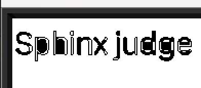
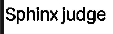
Although the font above only natively provides 8px bitmaps, it’s pretty easy to scale it to any size we like. However, the font will always appear jagged and low-resolution.
While the 8x8 bitmap font works, it sure isn’t pretty, and it’s quite limited: we can only use whatever font we’re willing to encode into this little 8x8 grid, and
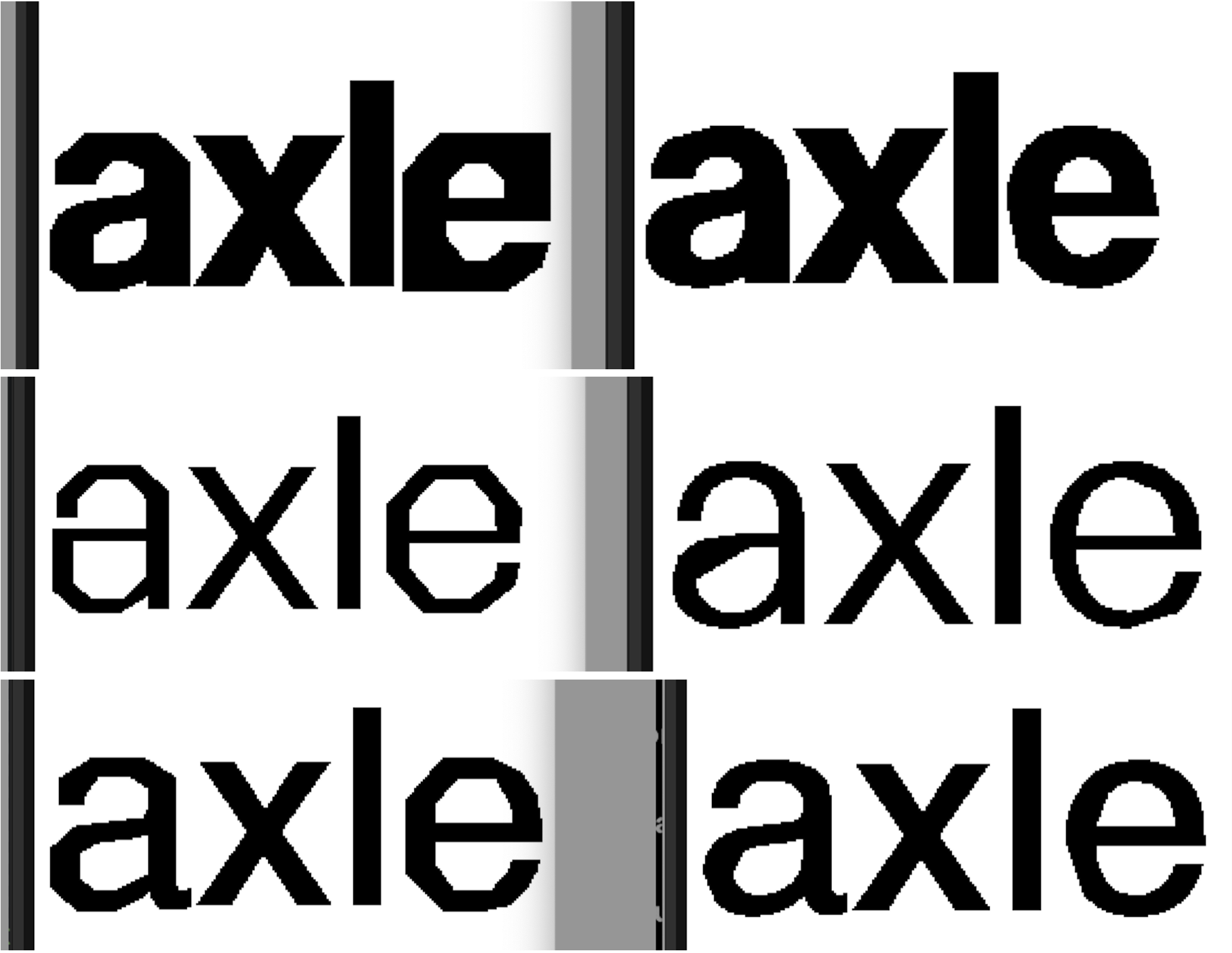
we’re unable to use any of the many fonts available online and in the public domain. Additionally, our 8x8 grid doesn’t give us much of a good way to describe curves, which are essential in some fonts (check out this a!).
Most importantly, writing a new font renderer sounds like fun.
TrueType
For the next leap in our text rendering journey, we turn to TrueType: the de facto standard for encoding and distributing fonts. Unlike our humble 8x8 bitmaps, TrueType fonts are distributed as structured binary files (.ttf). We’ll need to parse these files and render their data into pixels.
There’s few things in this world I love more than taking an opaque binary and gradually uncovering the organization that was present all along. Dissecting the underlying and general structure of a binary is as gratifying as anything I can imagine.
The TrueType specification gives a great introduction to the problem space (I highly recommend the overviews in Digitizing Letterforms and especially Instructing Fonts), but it doesn’t give much in the way of signposting “start parsing here”. I’ll save you the trouble.
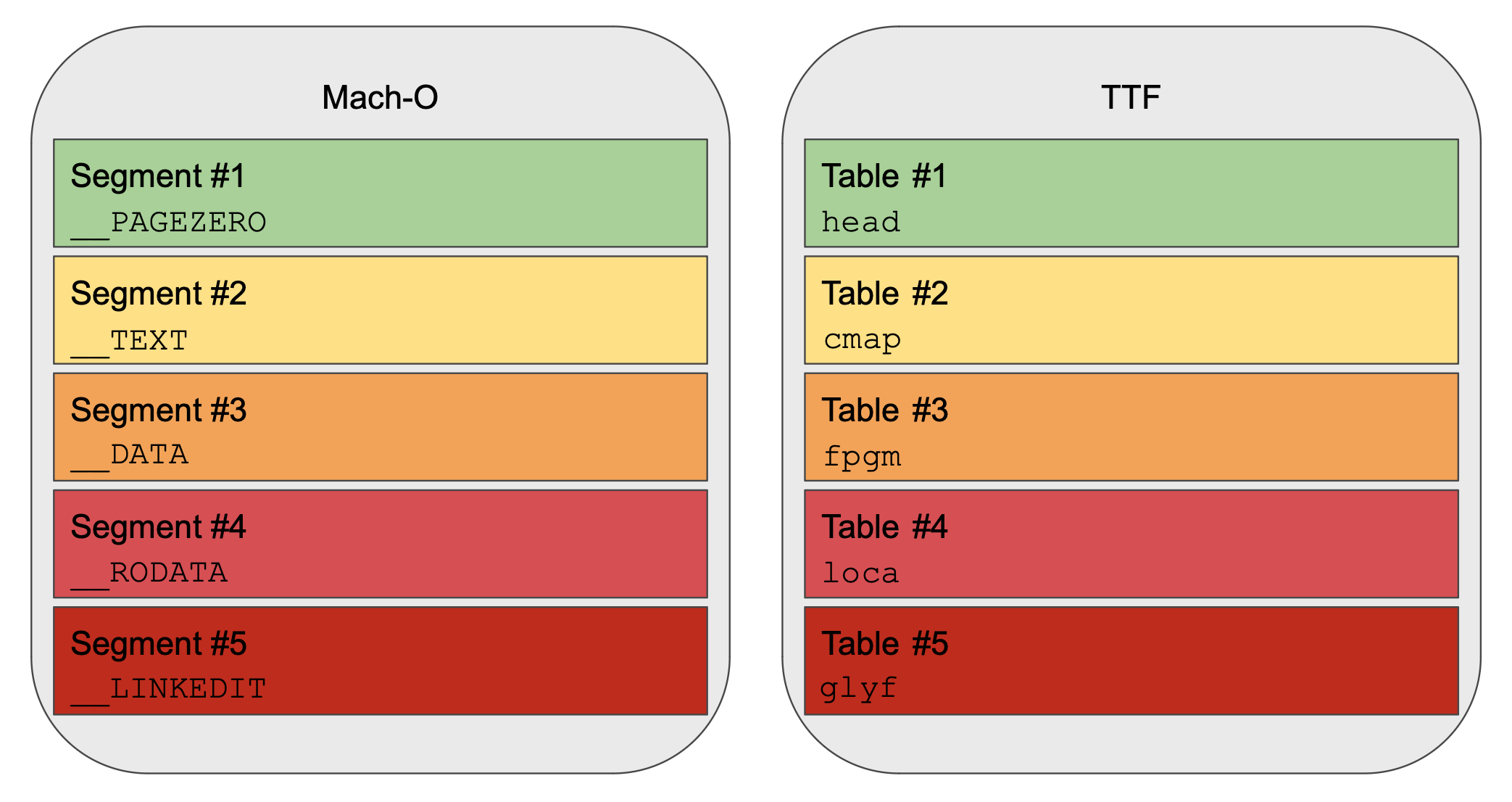
TTFs are structured somewhat similarly to Mach-Os. This is quite a nice surprise, because I’ve spent a lot of time parsing Mach-Os! Both file formats were developed at Apple✱ around the same time, so I suppose they had some design points in the air.
✱ Note
I don’t know all the history here. Please feel welcome to correct me if I’ve got this wrong!
Several people have helpfully reached out to correct this. Mach-O, of course, had its origins in the Mach project at Carnegie Mellon.
TTFs and Mach-Os are both largely structured around a flat series of sections, each of which is described by a table of contents at the beginning of the file. In the case of TTFs, each of these sections will contain some metadata or other that we’ll need over the course of rendering the font.
Before taking a look at these sections becomes fruitful, though, we need to know the fundamental process for describing fonts used by TrueType. The specification does a great job, so I’ll keep myself brief.
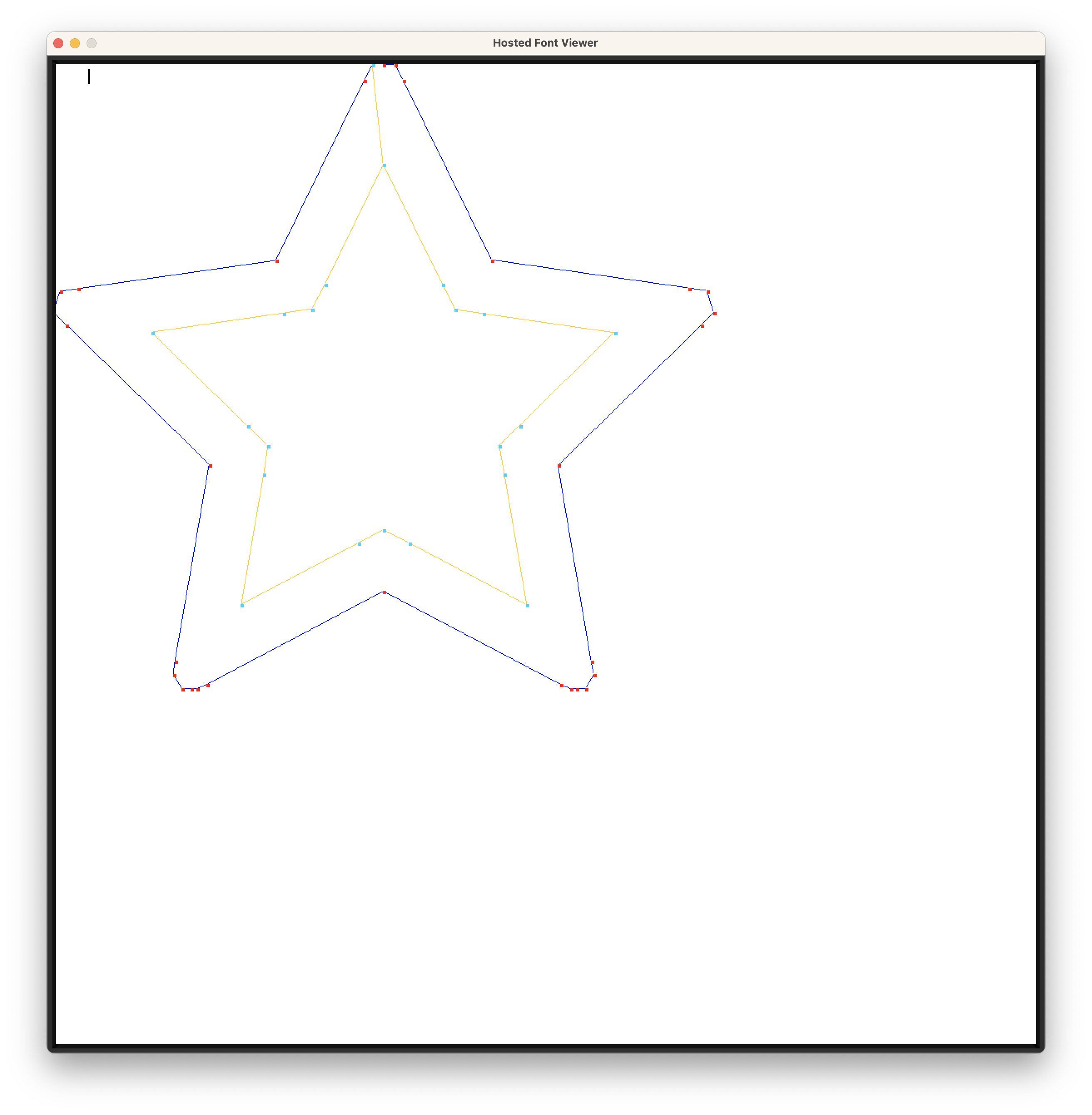
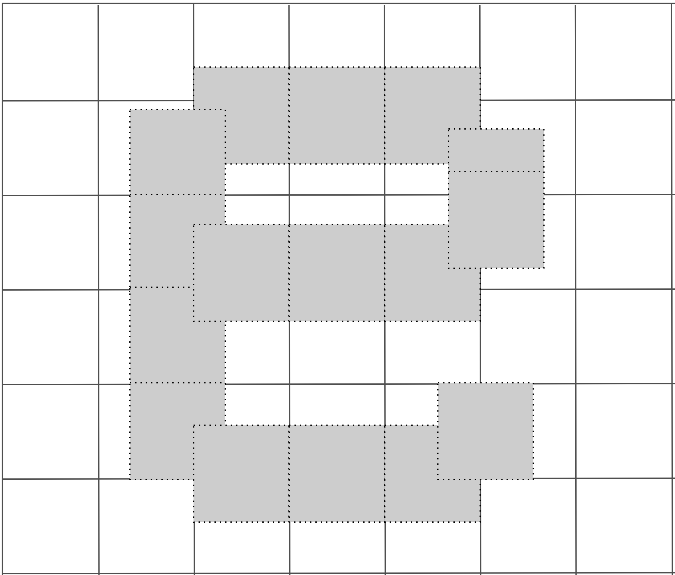
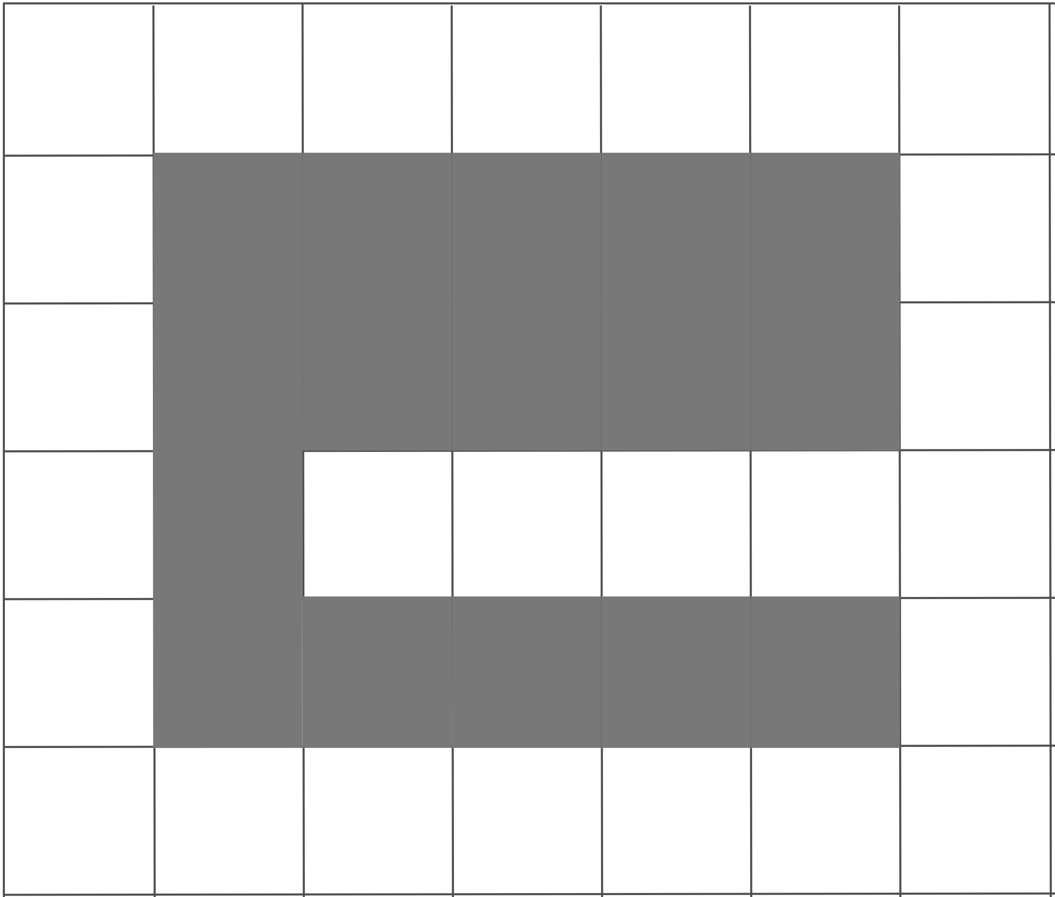
The collection of lines and curves used to visually represent a particular letter is referred to as a glyph. As an example, the glyph b consists of a vertical line and a semicircle.
Without further information, though, our renderer won’t know which glyph represents each character. We’ll need some additional metadata to convert from a character within a character map (such as ASCII or Unicode) to the glyph that a particular font is using to visually represent that character. The job of the TTF is dually to describe how to draw all the glyphs represented by the font, and to describe the correspondence between the character map and these glyphs.
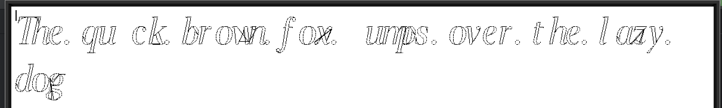
TrueType describes how to draw each glyph by listing a series of points, which collectively compose the outline of each glyph. It’s up to the renderer to connect these points into lines, to turn these lines into curves, and to ‘color inside the lines’ as appropriate. There’s more nuance here, but that’s the bare bones.
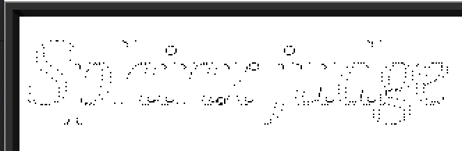
Rendering points without connecting them into lines
Things start to look a lot more comprehensible once you connect the dots.
Coloring inside the lines turns out to be more difficult than you might imagine✱.

|
|
|
|---|
✱ Note
My first implementation of this renderer didn’t draw any curves, but instead directly connected the points with straight lines. My colleague Amos implemented the ability for the renderer to interpolate the glyph outline along the curves described in the font, which really improved the look of things. Thanks, Amos!
Tangled Text Tables
Each section in the TTF is identified by a 4-character ASCII name. Different sections in the TTF contain different important metadata, such as:
glyf: The set of points for each glyph outline in the font (most important!)hmtx:✱ Spacing information, i.e. how far to advance the cursor after drawing each glyphcmap: The correspondence of Unicode✱ codepoints to glyph indexes
✱ Note
hmtx just gives the horizontal metrics. vmtx gives the metrics for the vertical direction as well.✱ Note
cmap section will specify which character maps are available, and it’s up to the parser to select whichever character map is convenient.Each of these sections contains a bunch of structured data describing their contents. Here, our first mini challenge presents itself. TTF was designed in an era in which neither RAM nor core cycles were cheap. Therefore, the designers of the format made sure it’d be as easy as possible for the renderer to complete its work. To this end, they offloaded two responsibilities to the font file itself:
- Efficient data structures that the renderer can walk to retrieve info (for example, lookup tables to map a character code to a glyph index)
- Pre-computation of some values used during lookup (for example, scaling parameters for binary searching a character map)
These optimizations aren’t so relevant today, but we’ll need to work with them nonetheless. The first one is particularly important: TTF is designed to be loaded directly into memory and read by the renderer in-place, without the renderer populating its own intermediary data structures. Inexplicably, though✱, the TTF stores all fields in big endian, so we’ll definitely have to do some work on our end before we can read any sane values out of font structures.
✱ Note
To be able to define and read from these font structures with minimal boilerplate and repetition, I set things up such that I could wrap any font structure fields in BigEndianValue. After I call .into(), everything is done and dusted and I can move on with my day. A little bit of structure definition upfront for some easy breezy parsing code down the line!
rust_programs/ttf_renderer/src/parser.rs
/// Here, we're modelling a structure that's defined by the TTF specification
#[repr(C, packed)]
#[derive(Debug, Copy, Clone)]
struct OffsetSubtableRaw {
    /// Note each field is wrapped in BigEndianValue
    scalar_type: BigEndianValue<u32>,
    num_tables: BigEndianValue<u16>,
    search_range: BigEndianValue<u16>,
    entry_selector: BigEndianValue<u16>,
    range_shift: BigEndianValue<u16>,
}

/// This marker trait indicates that this structure sits directly in TTF memory
impl TransmuteFontBufInPlace for OffsetSubtableRaw {}

/// This is our 'high-level' parsed representation
#[derive(Debug, Copy, Clone)]
struct OffsetSubtable {
    scalar_type: u32,
    num_tables: u16,
    search_range: u16,
    entry_selector: u16,
    range_shift: u16,
}

/// Convert the 'raw' TTF memory representation into our high-level representation with native byte order
impl FromFontBufInPlace<OffsetSubtableRaw> for OffsetSubtable {
    fn from_in_place_buf(raw: &OffsetSubtableRaw) -> Self {
        Self {
            scalar_type: raw.scalar_type.into_value(),
            num_tables: raw.num_tables.into_value(),
            search_range: raw.search_range.into_value(),
            entry_selector: raw.entry_selector.into_value(),
            range_shift: raw.range_shift.into_value(),
        }
    }
}
Ready for the payoff?
pub fn parse(&mut self) -> Fontrust_programs/ttf_renderer/src/parser.rs
let offset_table = OffsetSubtable::from_in_place_buf(self.read_with_cursor(&mut cursor));Oh yeah! We can parse our high-level, byte-order-corrected representation directly from the TTF memory without even needing to mention the raw TTF representation at the call-site. I’ll call that a win.
Parser
Handy APIs in hand, we’ll parse all the section descriptions at the start of the file.
The head section (or table, as TTF prefers) stores some important metadata about the font as a whole. We know that TTF describes glyph outlines via a series of connected points. But if we see a point like (371, 205), without further information we don’t have a reference for understanding where this sits visually. The head table gives us such a reference, by describing the glyph_bounding_box that all points sit within.
Next up, we’ll want to parse a character map to find out how we’ll correspond encoded characters to glyph indexes. Each character map will also be described in an extremely gnarly format that the parser will need to know how to read.
And now the exciting bit: parsing glyphs! The maxp table will give us some metadata on how many glyphs the font contains, while the glyph data itself is stored in glyf.
Before we can parse each glyf entry, we’ll need to know where each entry begins. The loca table will give us these offsets. However, nowhere is the size of each glyph’s data given explicitly in the font. Instead, the size of each glyph’s data is implicitly given by the difference with the starting offset of the next glyph.
The intrepid font parser will quickly notice that some glyph descriptions appear to have no size. This is intentional: some glyphs, such as the one corresponding to the space character, have no visible manifestation aside from the negative space they occupy. When the renderer tries to draw one of these zero-sized glyphs, we’ll just advance the cursor based on the corresponding htmx size for this glyph.
We’ve actually got three distinct types of glyphs:
- Polygon glyphs
- These glyphs are the classic case: an ordered collection of edge points and control points that should be connected in a series of curves.
- Blank glyphs
- Special case for glyphs such as those corresponding to the space character.
- Compound glyphs
- Glyphs manufactured by combining and scaling other glyphs.
The third category is really interesting! The glyphs for i and j both share an identical dot on top, and there’s no need to duplicate its description in the draw instructions. Instead, we can just say that i and j are each composed of a couple of glyph fragments laid out on the canvas at specific scales and positions.
There are all sorts of counterintuitive edge cases with compound glyphs. As an example, we know that traditional polygon glyphs specify how far the cursor should advance after drawing them via corresponding entries in the hmtx and vmtx tables. However, how far should the cursor advance for a compound glyph? Sometimes the compound glyph has its own metrics table entries, and sometimes the compound glyph is annotated with a special flag indicating that it should take its cursor advance metrics from a specific child glyph.
rust_programs/ttf_renderer/src/glyph.rs
enum CompoundGlyphComponentFlag {
    HeaderValuesAreWords,
    HeaderValuesAreCoordinates,
    RoundCoordinatesToGrid,
    CustomScale,
    MoreComponentsFollow,
    HasDifferentScalesForXAndY,
    HasTwoByTwoTransformation,
    HasInstructions,
    UseMetricsFromThisComponent,
    ComponentsOverlap,
}
Compound glyphs don’t always directly contain polygon glyphs. Instead, a compound glyph can be composed of a tree of other compound glyphs, all stretched and scaled and repositioned across the bounding box.
Hinting
TrueType famously defines a hinting VM that’s intended to help retain the essence of a font when rendering at low resolutions to a limited pixel grid. The job of the program running under this VM is to nudge the glyph’s control points into a specific layout on low-resolution bitmaps✱.
✱ Note
Let’s say you’re trying to scale down a glyph’s points to fit on a small grid. If the render resolution isn’t exactly divisible by the glyph’s point spacing, you’re going to get scaling artifacts when you round each glyph point to a pixel.
|
|
|---|
The font can embed a little program that, when executed, nudges the glyph’s layout points to better represent the glyph within the available grid.

|
|
|---|
Our renderer will need to implement this VM, which is always a fun endeavor.
The hinting VM is built around a standard (and incredibly satisfying) interpreter loop that modifies a virtual machine state based on the operations indicated by the byte stream:
rust_programs/ttf_renderer/src/hints.rs
0x4b => {
    // Measure pixels per em in the projection vector's axis
    if operations.should_print() {
        println!(
            "MPPEM\tMeasure pixels per em in {:?}",
            graphics_state.projection_vector
        );
    }
    if operations.should_execute() {
        let val = match graphics_state.projection_vector {
            Axis::X => graphics_state.font_size.width,
            Axis::Y => graphics_state.font_size.height,
        };
        graphics_state.push(val as u32);
    }
}
0x50 => {
    // Less than
    let e2 = graphics_state.pop();
    let e1 = graphics_state.pop();
    let result = e1 < e2;
    if operations.should_print() {
        println!("LT\tLess than? {e1} < {e2} = {result}");
    }
    if operations.should_execute() {
        graphics_state.push(if result { 1 } else { 0 });
    }
}
There a slew of hilarious little engineering challenges that come up when trying to execute functions targeting a font’s operating environment.
rust_programs/ttf_renderer/src/hints.rs
pub(crate) fn identify_functions(instructions: &[u8]) -> Vec<FunctionDefinition> {
    // We have a bootstrapping problem: Functions can't be run to
    // completion without the context (arguments, etc.) from the caller, but we need to
    // parse function boundaries before we can run callers since callers address functions via
    // identifiers that get created when the fpgm table is executed.
    // To resolve this circular dependency, we use a simple heuristic to identify function
    // definitions, rather than doing a full interpreter pass.
    // This has the downside that our heuristic can't tell the
    // difference between code and data.
    // If some data is pushed to the stack with the same value as the
    // function definition opcode, we may interpret it as a function definition.
    //
    // ...
}
TrueType Quirks
Occult Memorabilia
The hinting VM is all about nudging the glyph’s outline points so that they look better on a small pixel grid. All of these points that actually compose a part of the glyph outline are in the ‘Glyph Zone’.
However, the VM designers realized that it was sometimes useful to have a point that wasn’t really part of the outline, but was just used as a reference when doing distance calculations. These points don’t belong in the Glyph Zone, so instead TrueType places them in a different space called… the Twilight Zone.
The TrueType designers were clearly fans of the paranormal. TrueType provides convenient support for describing emboldened and italicized versions of fonts by embedding offsets to apply to each point in a glyph outline. A font variation might need the entire bounding box of a glyph to be modified too, so there are ‘phantom points’ corresponding to the corners of the bounding box that can be stretched and squeezed.
Implied Control Points
The TrueType specification suggests to the reader, hey! Maybe it’d be possible to save space by letting the renderer deduce missing control points?
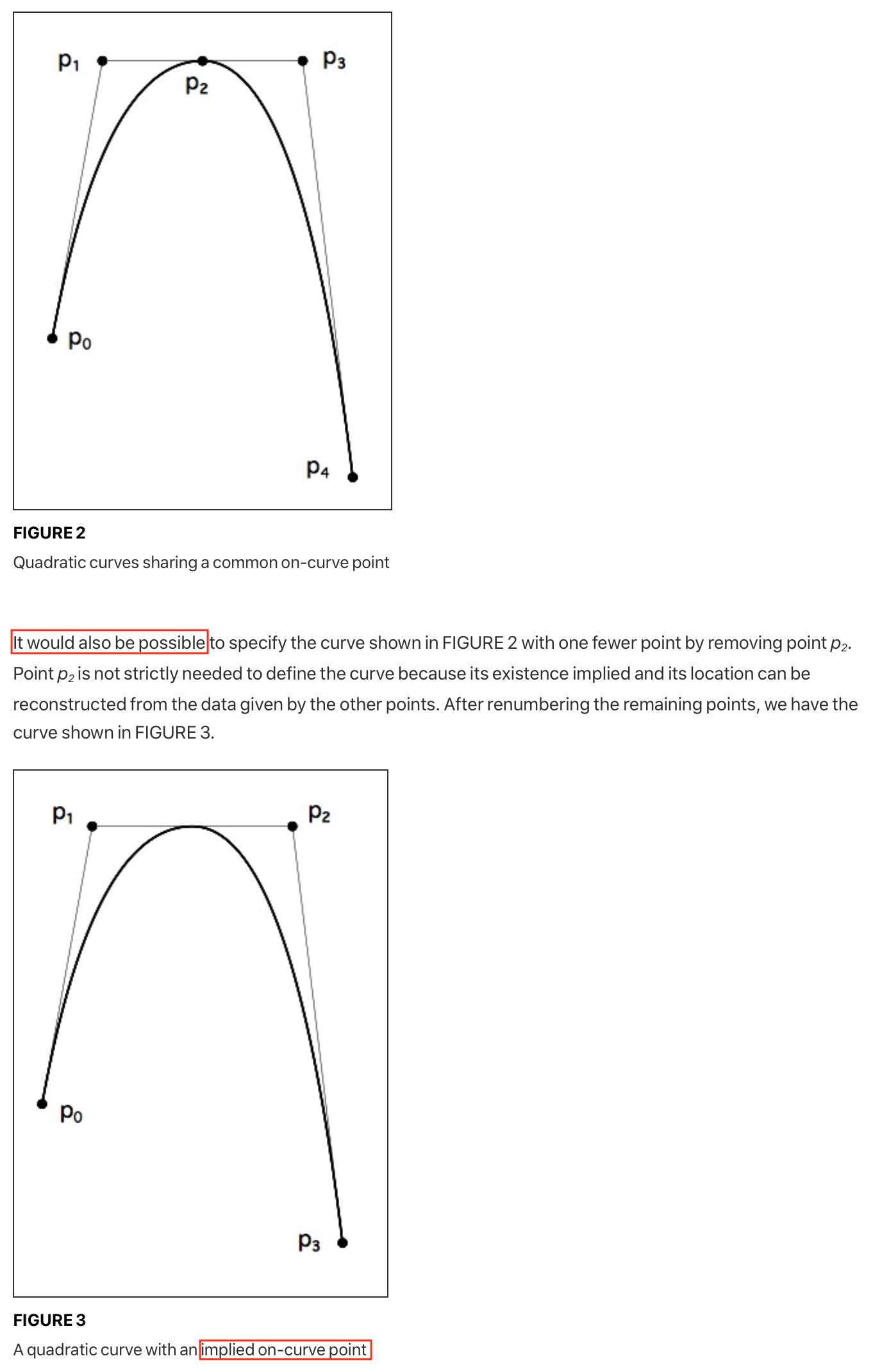
Despite the casual tone of observation, renderers are actually required to support this. Fonts rely on this all the time! This is the only mention of it in the whole spec! Everyone needs to detect and insert implied control points, all on the back of one introductory diagram.
Hint: Assume Nothing
Like we’ve seen, TrueType has sophisticated support for manipulating the rendering process in constrained font sizes. But like any good programming environment, it also provides lots of escape hatches. One such escape hatch is the bloc table, which essentially says “if the font size is too small, ignore the glyph curves and hinting programs and just render these tiny bitmaps instead.”
Firming Up a Renderer
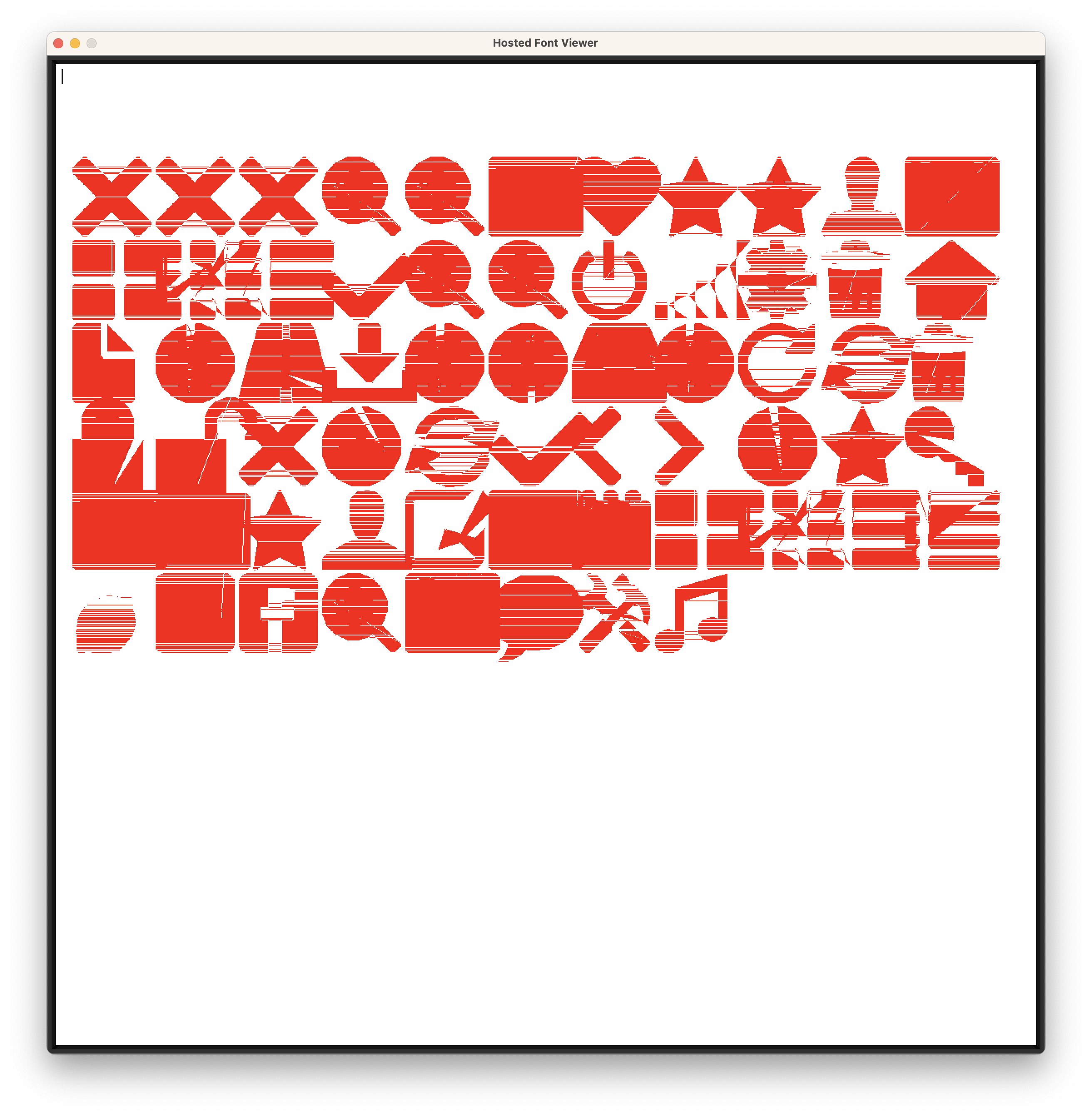
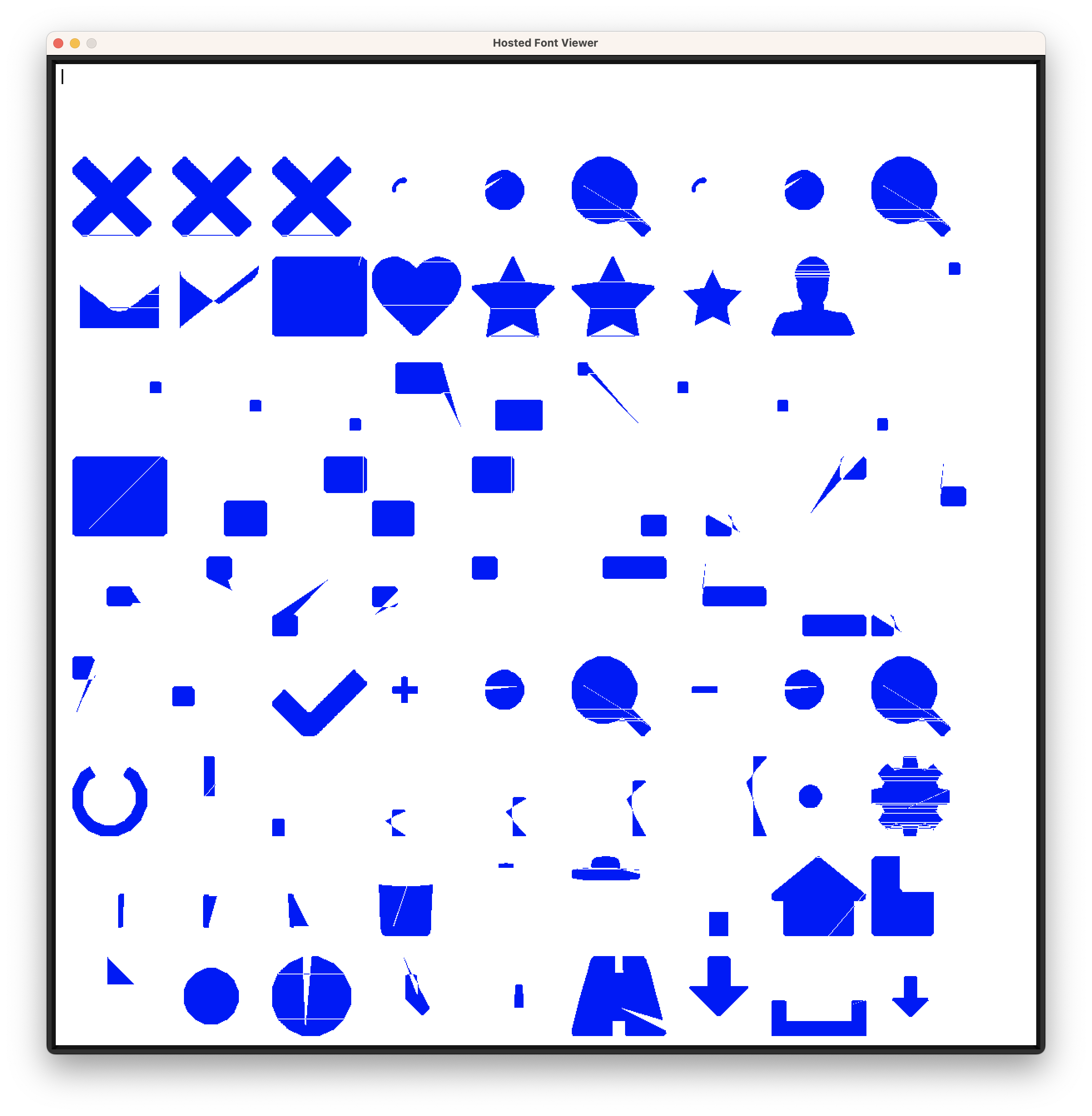
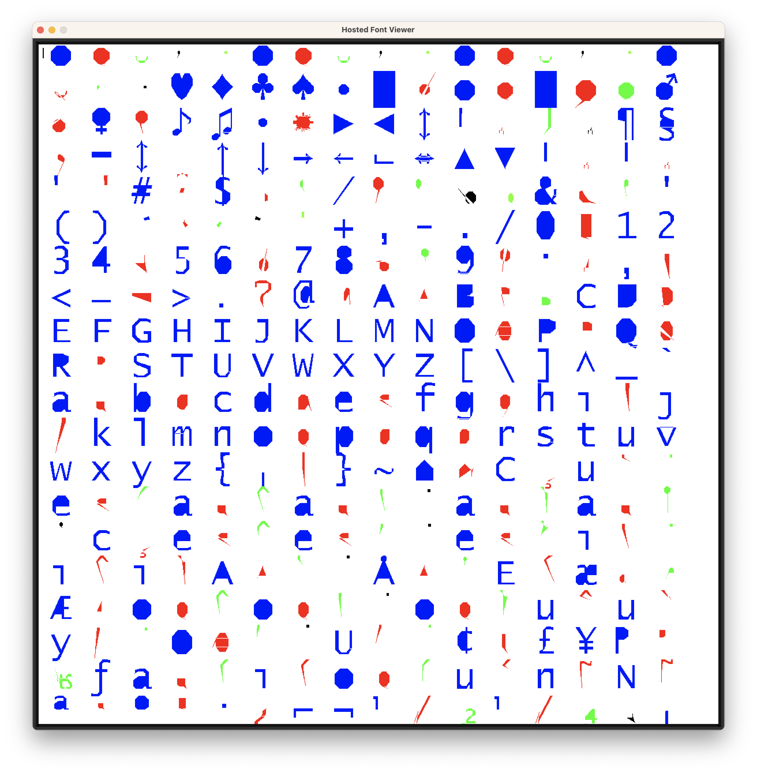
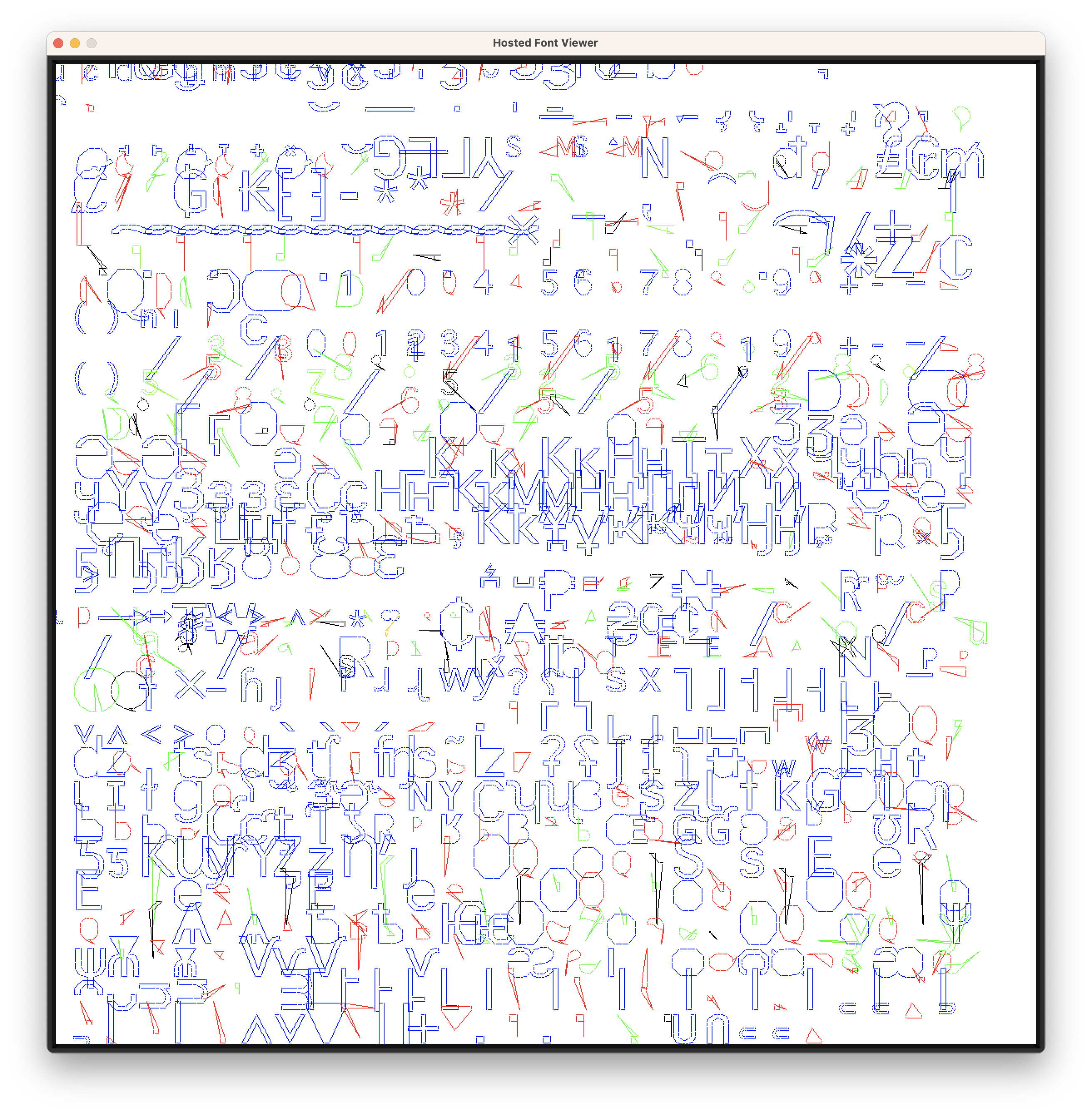
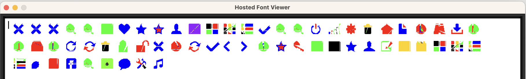
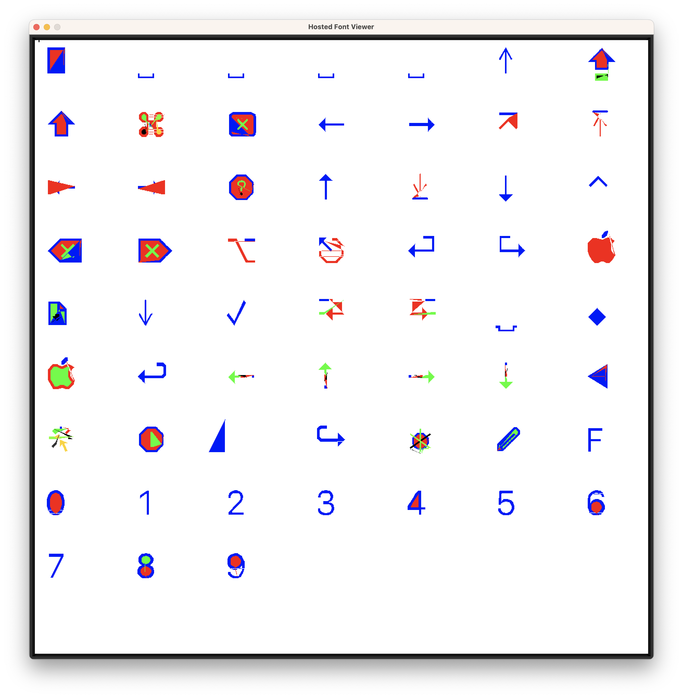
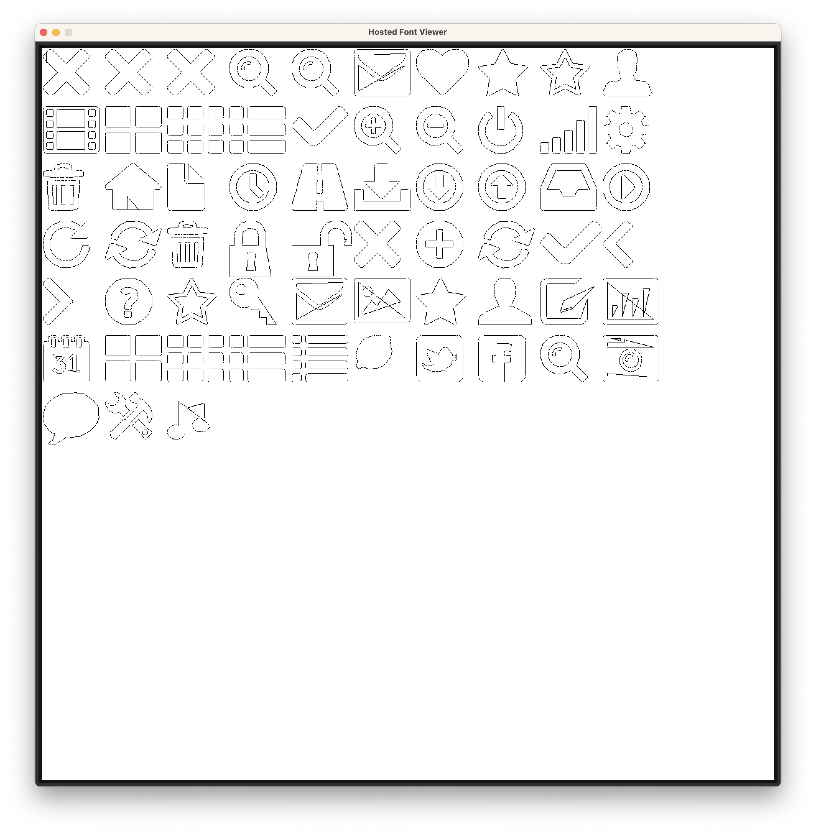
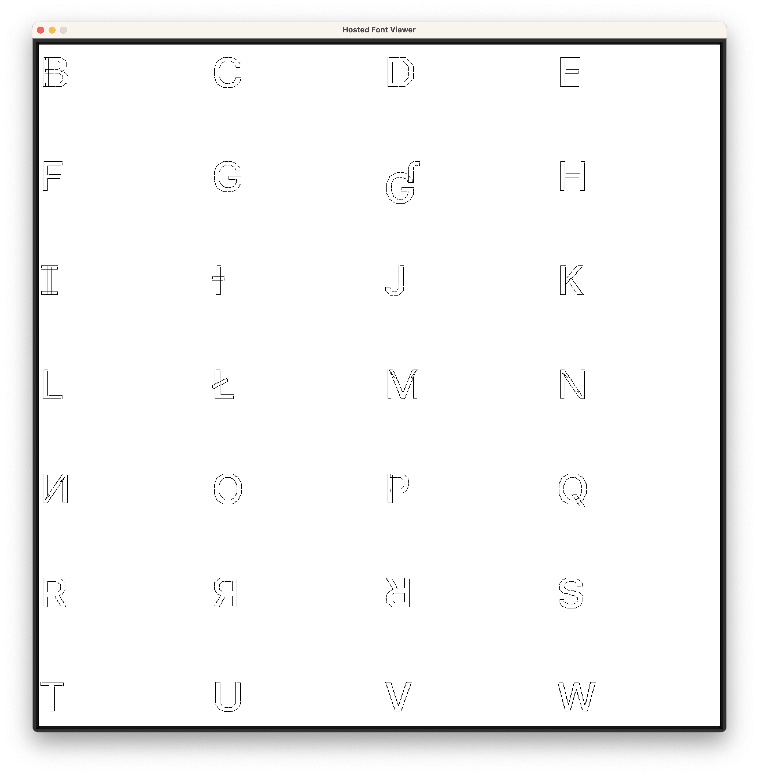
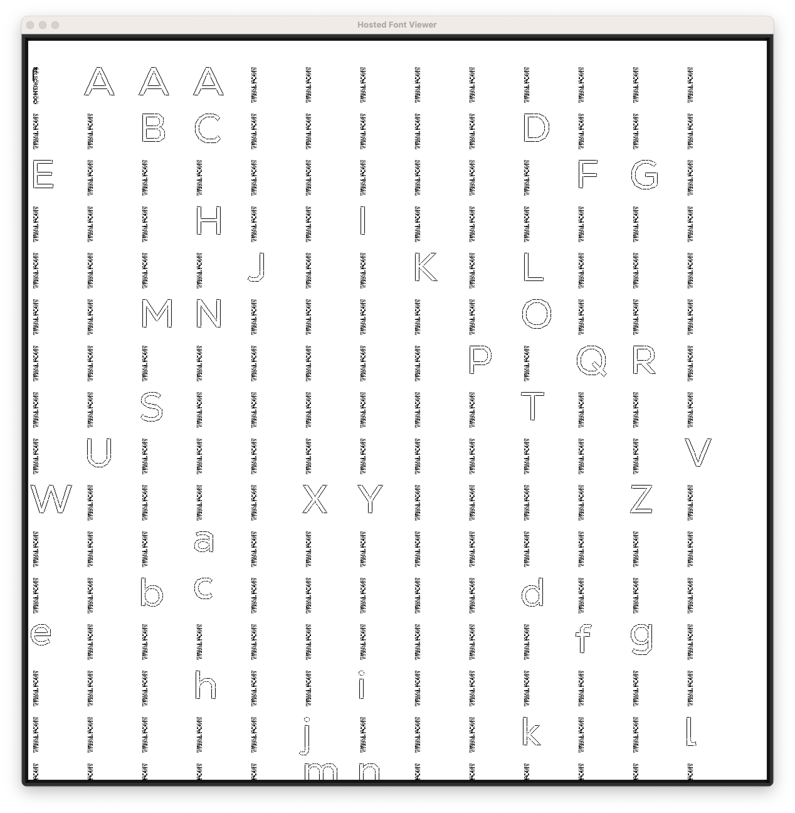
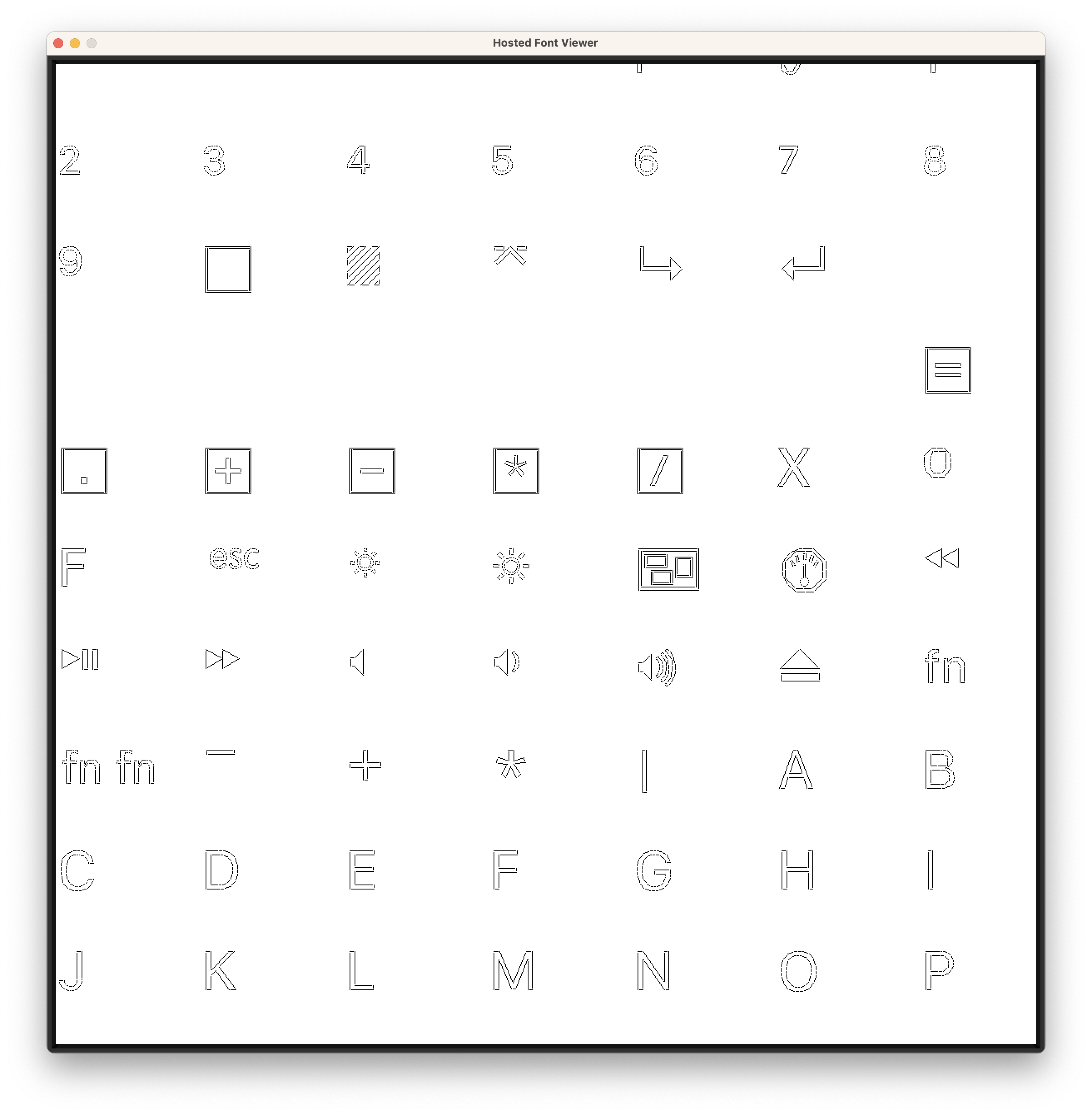
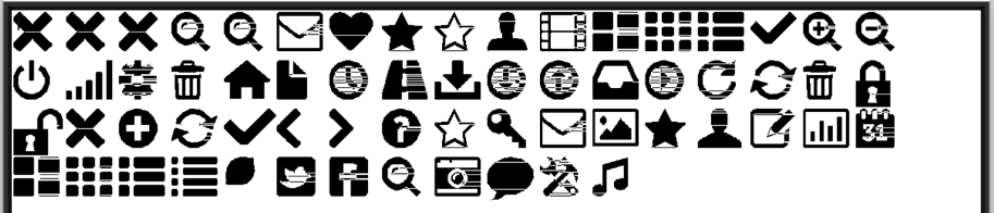
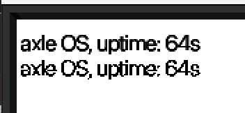
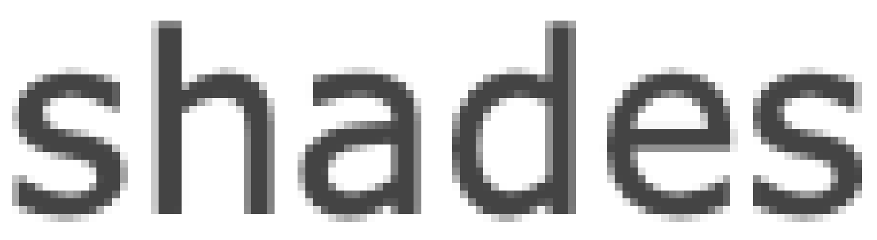
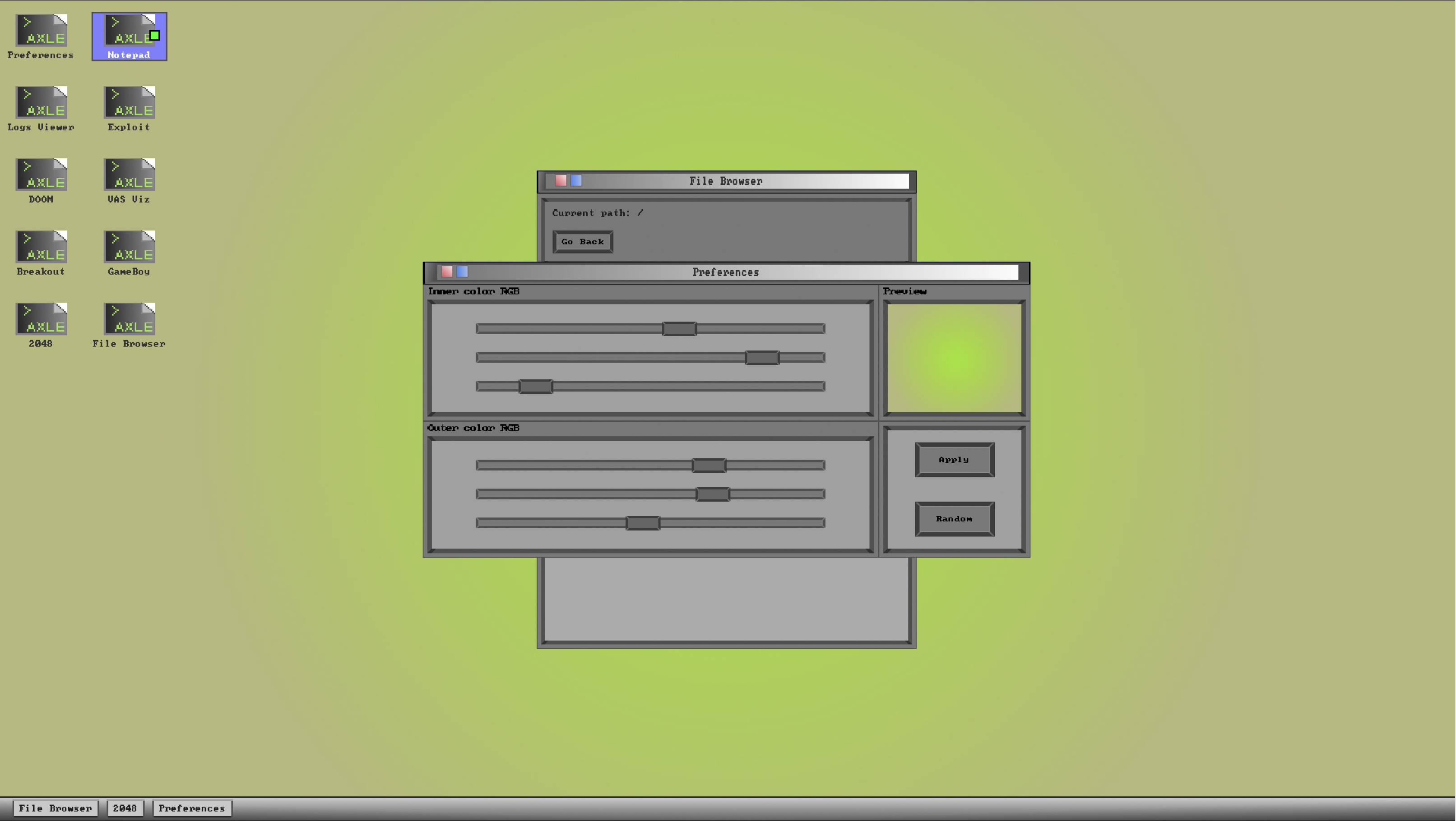
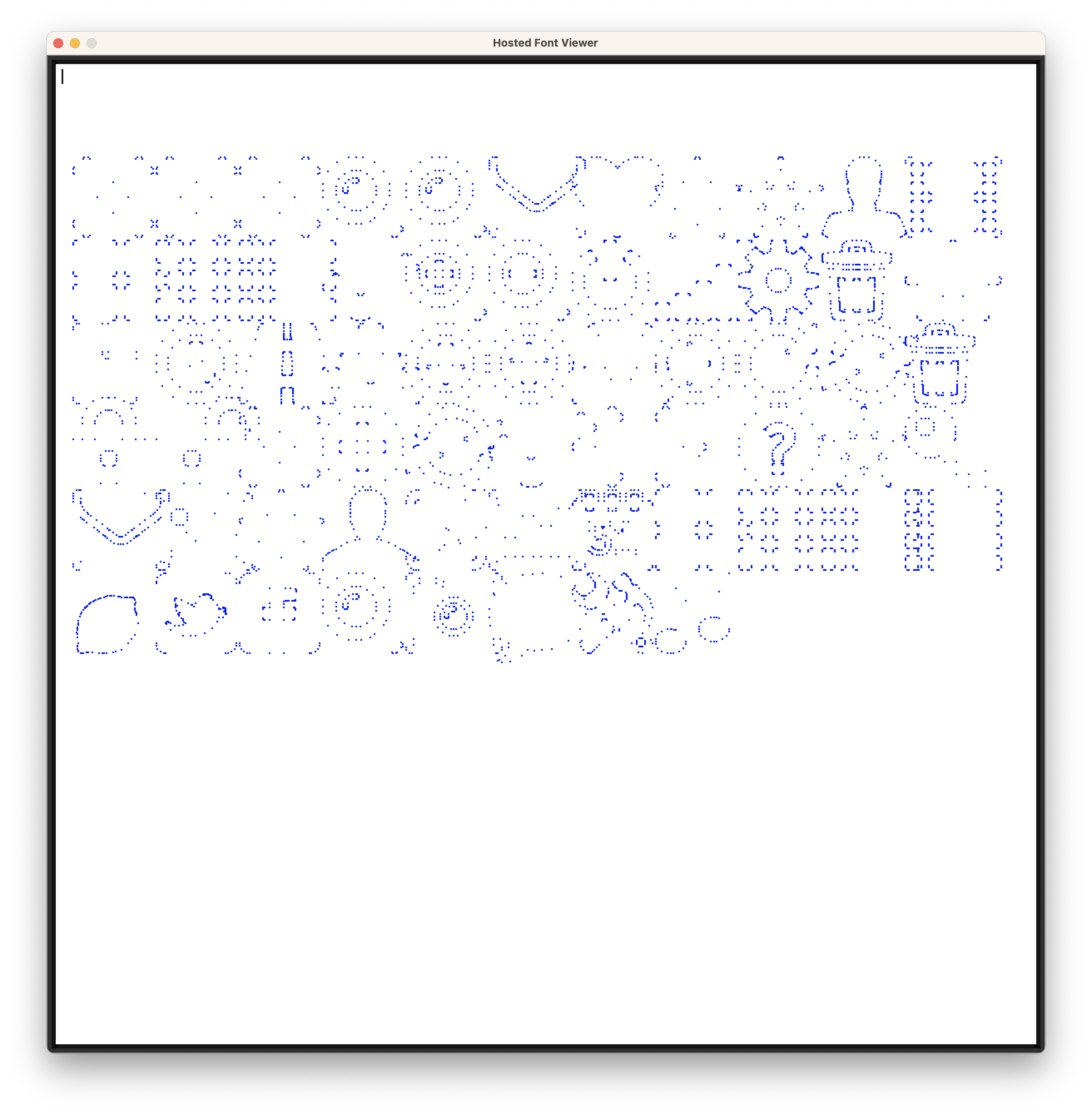
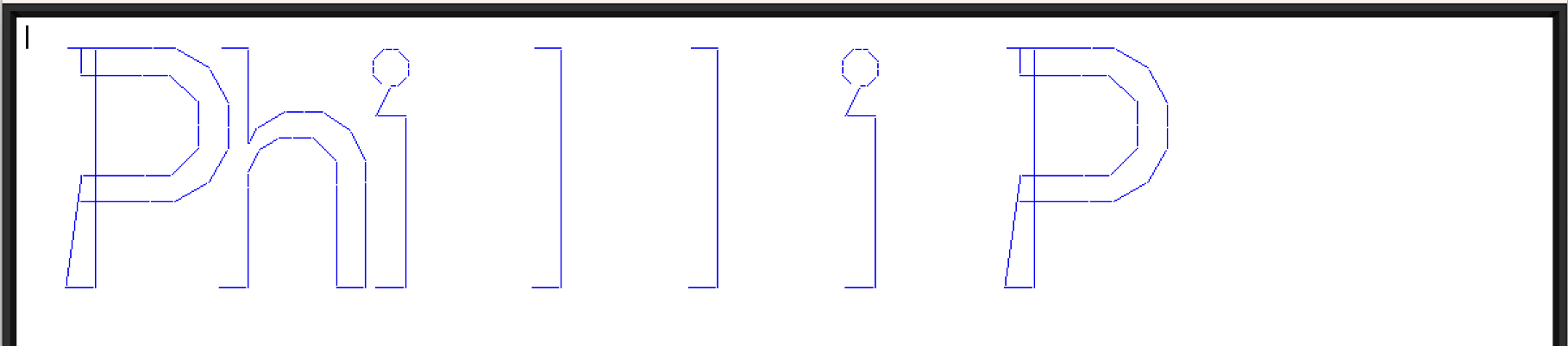
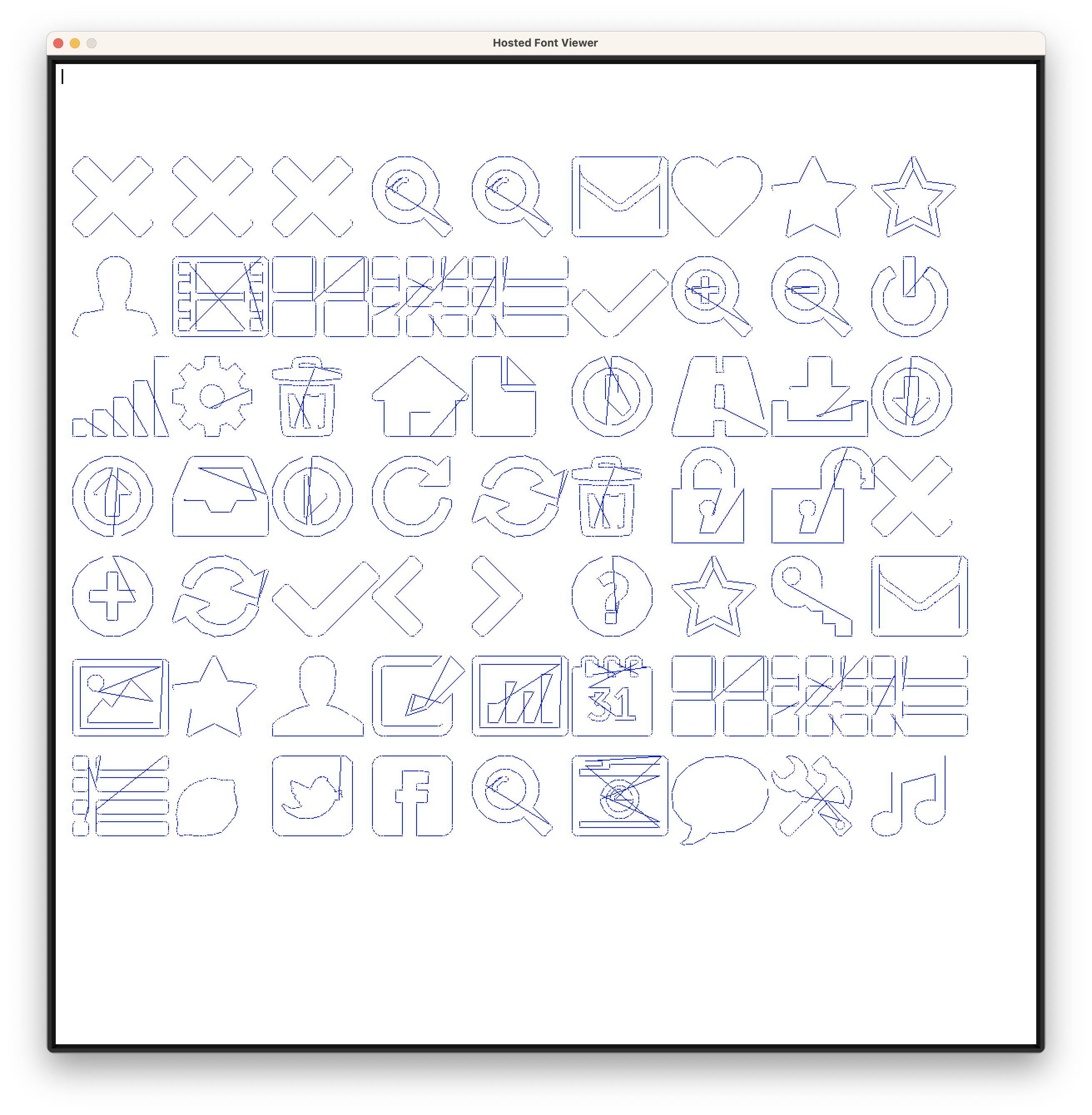
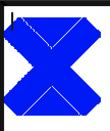
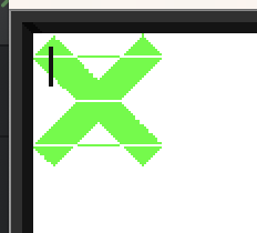
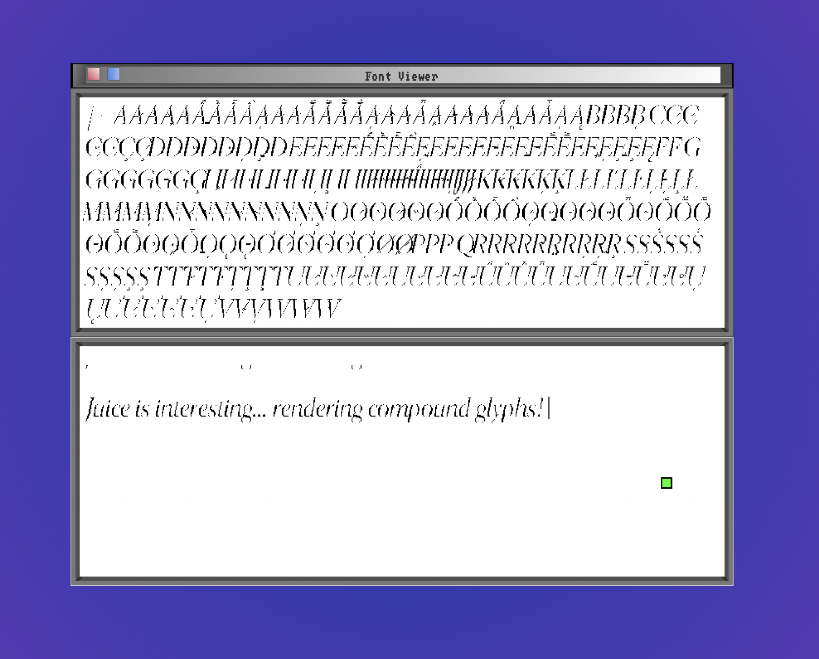
There’s still work to do to integrate this font renderer neatly in all the stacks that wind up displaying text on axle’s desktop, but the foundations are ready. Here’s what things looked like the last time I worked on propagating TrueType throughout the desktop.
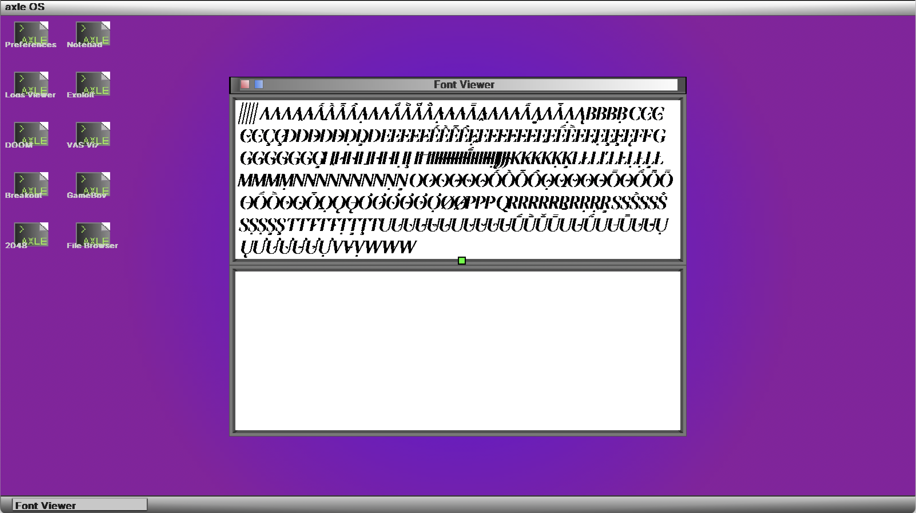
The source code for this renderer is here. Below are some screenshots from the course of this renderer’s development.