Pastel chips of content
Reading time: 3 minutes
I had a hankering to tweak this blog’s presentation a bit. Here’s what it looked like this morning:
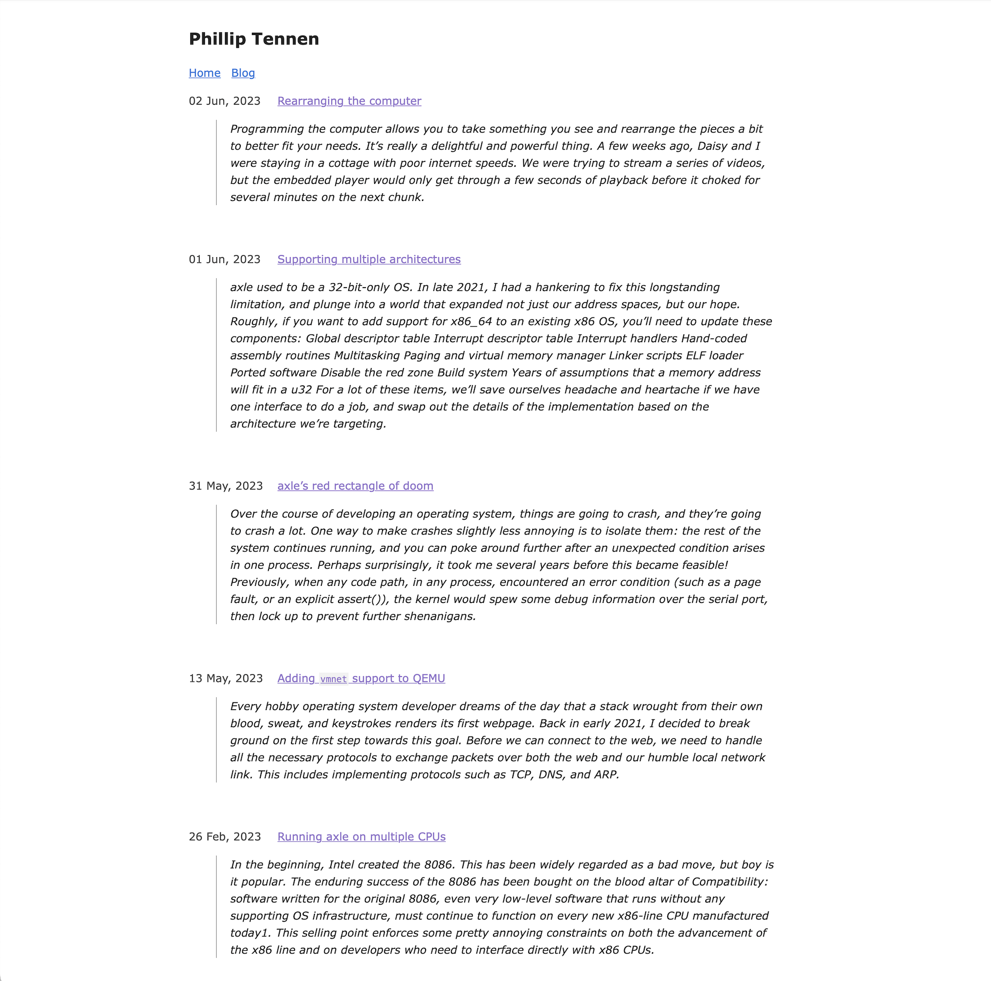
Bleugh! Straightforward content? Simple design? Restraint? Thanks, but no. It’s like this guy’s never heard of responsive web pages.
First, let’s make each of those posts pop a little bit more.
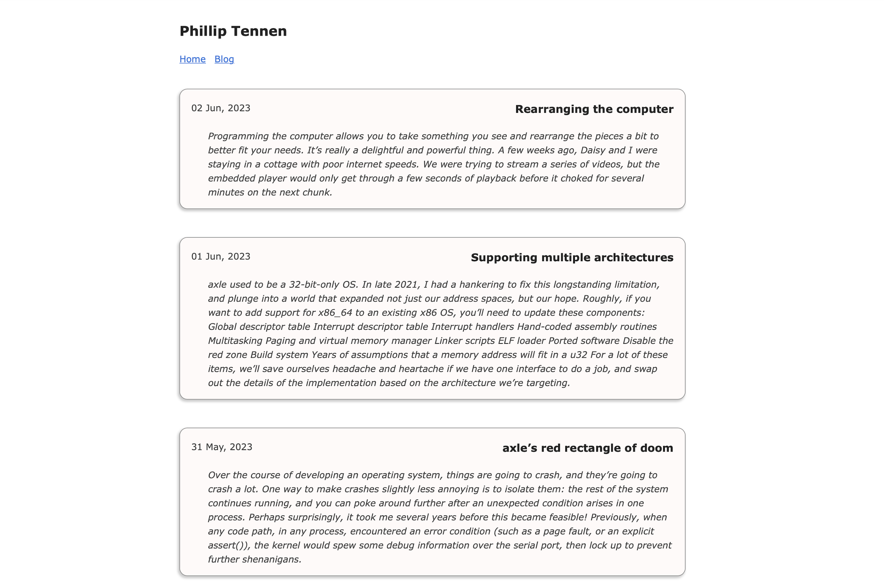
Yeah, yeah! Subtle, I like it. Tiny thing, it needs more color.
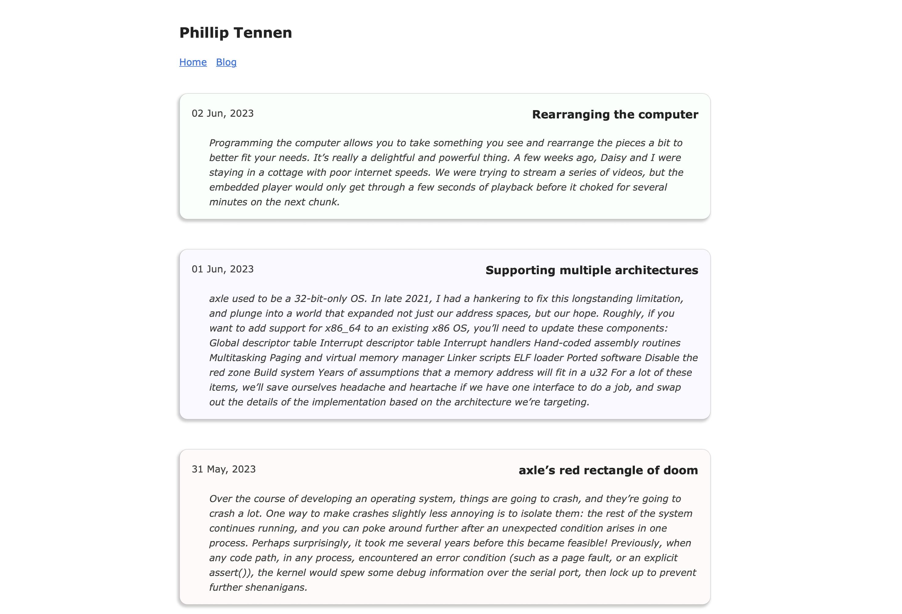
Now we’re talking.
I manually picked out some pastels and selected one randomly for each blog post chip.
chip.js
const colors = [
    'rgb(255,250,249)',
    'rgb(255,251,249)',
    'rgb(255,254,249)',
    // ...
];
Let’s add some shine to the blog post detail page. Here’s where we started:
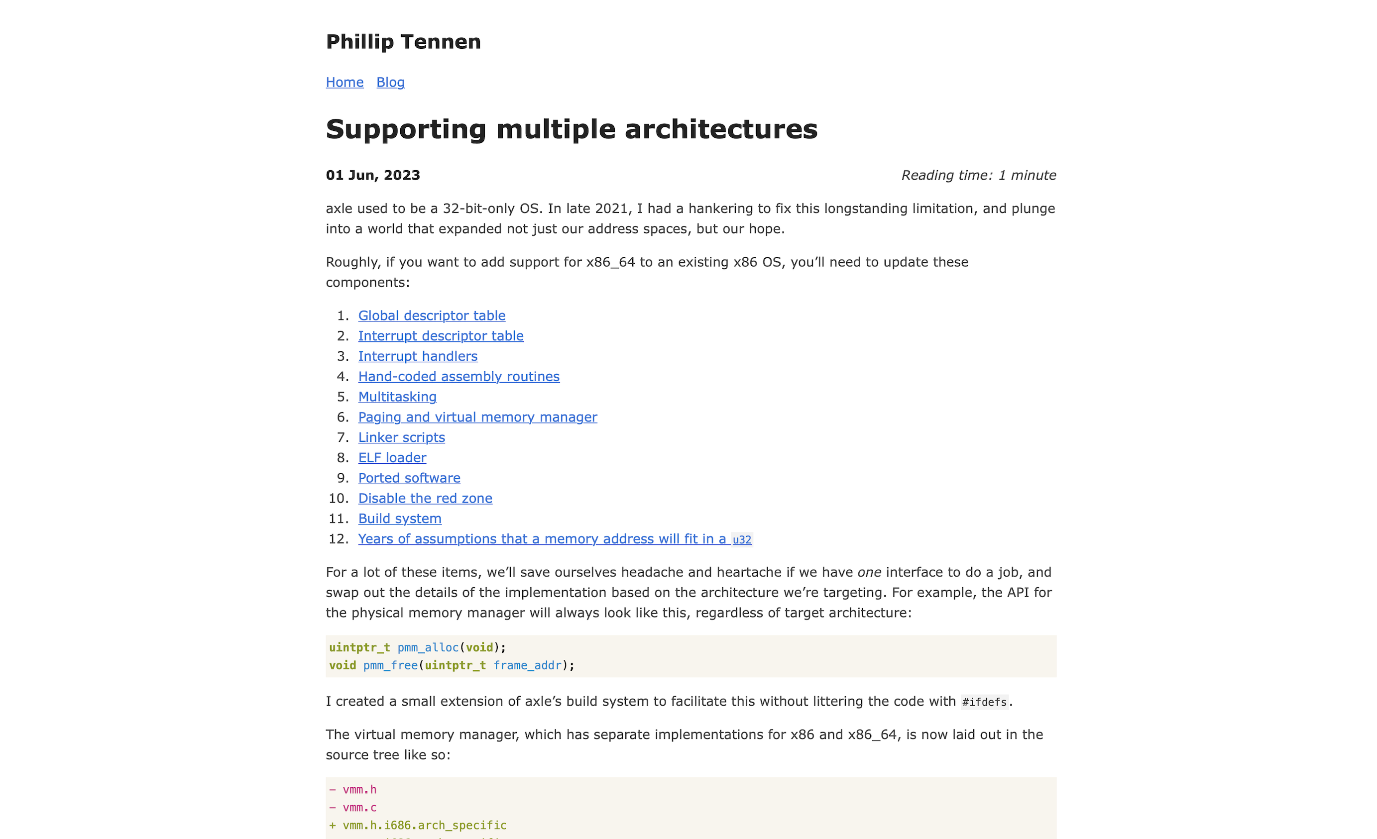
I differentiated the title section, and gave the main content the same pastel chip design we used on the list page.
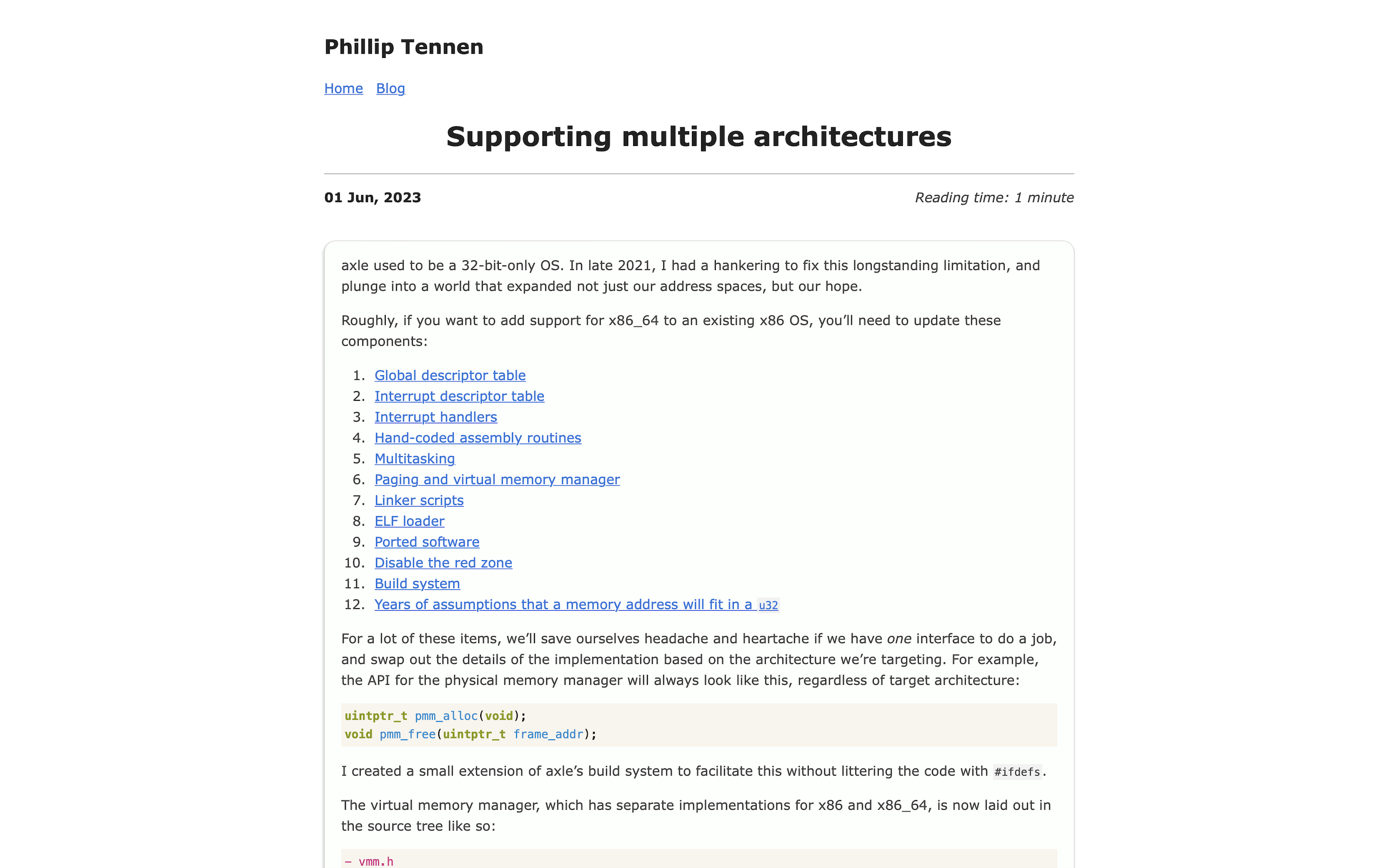
I could see that the pastels we use in the list view are a little too rich to sit as a constant background while reading a long-form post. What should we do? I don’t want to hard-code a set of ’light pastels’ and ‘very slightly lighter pastels’. Firstly, I don’t trust my eye enough, and secondly it sounds cumbersome.
Instead, let’s generate the colors on the fly.
Looking at the colors I selected through manual color picking, I could see a pattern:
one color channel was at full intensity (255), while the other two channels had a smidge taken off the top. Let’s generate all the possible color codes following this pattern:
chip.js
const colors = [];
for (const subtract1 of range(1, pastelDepth)) {
    for (const channel1 of range(0, 3)) {
        for (const subtract2 of range(0, pastelDepth)) {
            for (const channel2 of range(0, 3)) {
                // Don't subtract from the same channel more than once
                if (channel1 === channel2) {
                    continue;
                }
                const color = [255, 255, 255];
                color[channel1] -= subtract1;
                color[channel2] -= subtract2;
                colors.push(color)
            }
        }
    }
}
colors = [...new Set(colors)];
colors.sort();
This gives us a nice auto-generated set of pastels. I think there’s a more elegant way to express this idea, but the only thing that still captures my attention is candy colors.
Here’s what this generated color list looks like:
This code gives a very natural way to tweak the ‘depth’ of the pastels, by varying how far we’re willing to pull each channel away from full intensity. For example, a depth of 10 means we’ll generate all the colors in which any two channels have any value between 245 and 255. A higher depth naturally produces richer colors, since the color channels are allowed to stray further below full intensity. On the list page, where we can tolerate a bit more richness, we’ll use a depth of 8. On the post detail page, where readability is key, we’ll generate pastels with a maximum depth of 3.
We’ll also need a way to control the depth that each page will use. My web development chops are nascent, so I just did what made sense to me. On each DOM element that should be colored with the chip design, I included a pastel-depth-{num} class. The JavaScript then looks for a class matching this format to know what colors to pick from.
chip.js
const classes = $(this).attr("class");
const pastelDepthClassPrefix = "pastel-depth-";
const pastelDepthClass = classes.split(/\s+/).find((val, i) => {
    return val.startsWith(pastelDepthClassPrefix);
});
const pastelDepth = parseInt(pastelDepthClass.replace(pastelDepthClassPrefix, ""));
generateColors(pastelDepth, ...);
list.html
<ul class="blog-posts">
    {{ range .Pages }}
    <div class="blog-post-container pastel-depth-8 lift-on-hover">
        <li> ... </li>
    </div>
</ul>
single.html
<div class="blog-post-container pastel-depth-3">
    <content>
      {{ .Content }}
    </content>
</div>
This blog post, and the content described herein, was my first time trying JavaScript. More importantly, it was my first time using the DOM as a canvas.